TRENDZINE 2019 // DAY 1 – THE MOST INSPIRATIONAL GRAPHIC DESIGN TRENDS FOR 2019
WANT TO STAY ON TOP OF THE LATEST GRAPHIC DESIGN TRENDS?
This review illustrates how styles are changing and evolving, and how important it is to keep modern artworks that resonate with consumers and clients. At antipod we are very fan of fresh and catchy design, so we selected for you one brand case study and 5 of the top spotted picks:
// A new brand identity and design system for MAILCHIMP //
As a starter, Mailchimp stands for us like a good case study to highlight some design trends that you will discover in further detail below. The famous email campaign platform adopted a new brand identity, that is explained in detail on their own website.
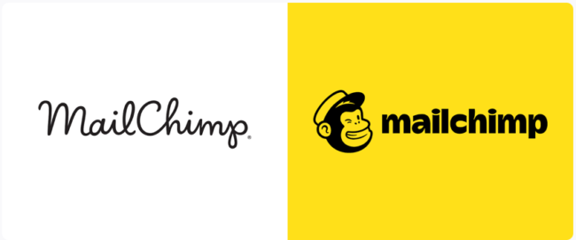
Here is the before/after look of their logo:
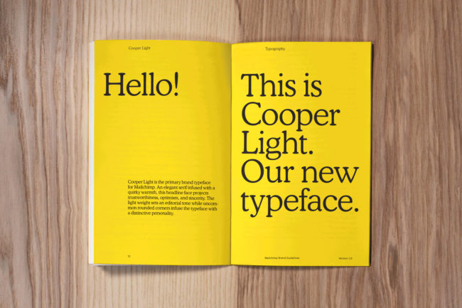
They adopted a serif font as their new brand typeface:
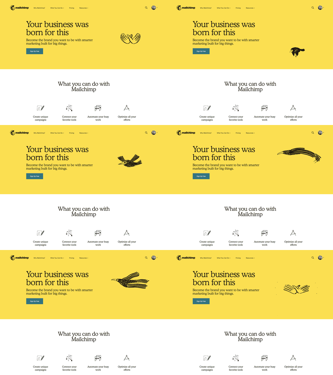
Here is an example of their new illustration and motion system, which acts as a counterpoint to their standardized core brand elements. “These expressive parts of our brand are more organic and playful while still communicating a message”.
Source: mailchimp.com
// The year of the serif fonts //
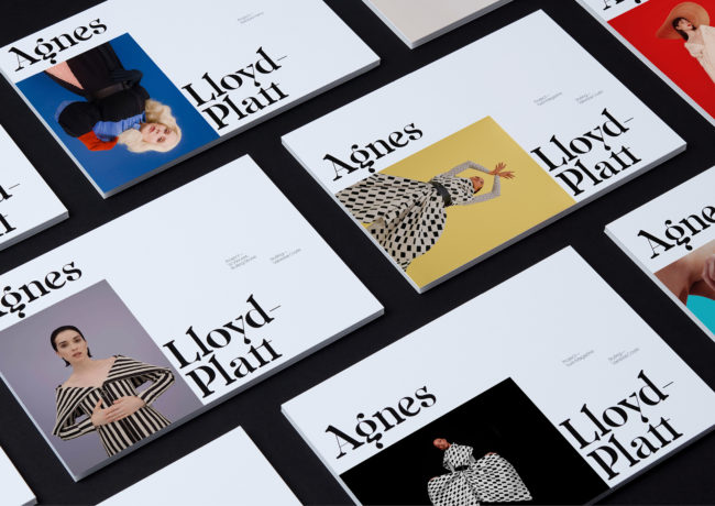
Custom type is becoming more and more necessary for brands that really want to stand out and increasingly a signature serif type or logomark is what designers are turning to. Why? Because after years of dominance the clean sans serif is now seen as “soulless” and “characterless” while serifs are perceived as quirky cute, smart, and bursting with personality. The past year has given us some gorgeous plump serifs that seem pulled from the days of cast-metal type. While sans-serifs and hand-drawn fonts will continue to be highly visible, this is the year where the range and diversity of serif fonts will explode.
Source:Agnes Lloyd-Platt
// Custom illustrations lighten up //
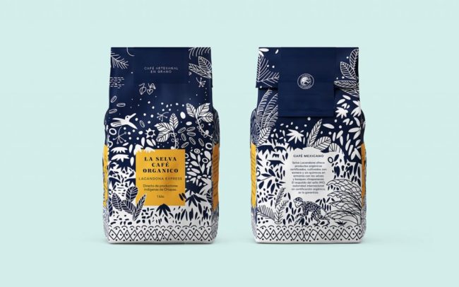
Custom and hand-drawn illustrations are a great way to make your design stand out. They are fun, creative, and original – and that’s why you are going to see more and more brands opting for custom art.
After years of bold, thick lines in illustration, there’s been a recent rise in more delicate, elegant illustration. Heavily influenced by botanical and natural elements, this trend is more feminine and appeals to a more innocent and childlike part of us all. We’re seeing it take a front seat particularly in packaging design, where intricate designs are rendered beautifully against a textured paper background. With addition of premium materials like foil and embossing, these designs strike a balance between maximalism and simplicity.
Source: mamba studio
// Complex gradients and duotones //
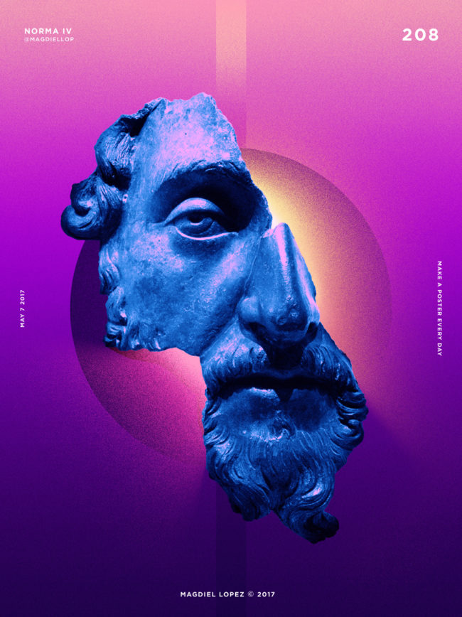
Gradients—“color transitions,” as they are sometimes called—and duotones started popping up last year, but this year they will become even more complex and creative. Instead of just using gradients for backgrounds, designers are finding new ways to incorporate those techniques into their designs. Recently they’ve definitely begun to creep back into logo design more heavily. Simple one-color logos aren’t enough; more and more are showing up with some kind of gradient. Some are the expected combinations (blue/purple, red/orange) but others use chunkier duotone fades.
Illustration: Magdiel Lopez
// 3D design and typography //
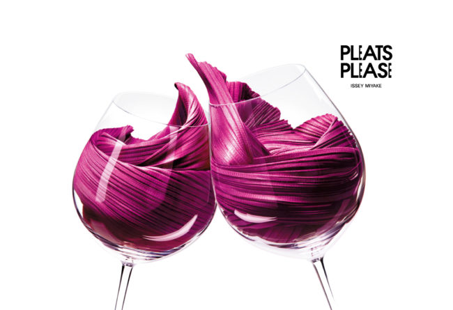
Three dimensional works seems to be everywhere right now: entire compositions that have so much depth, you can’t help but reach out and touch them. 3D typography especially feels just about ready to pop. The best part about it is there’s no particular type that works best for this trend: bold, skinny, sans-serif, script, any font can be rendered in 3D. Beyond typography, we’re seeing a lot of gorgeously rendered 3D compositions, like Issey Miyake’s marriage of textiles and food, that embark us into futuristic landscapes of color, type and form.
Source: Issey Miyake
// Modern Mid-Century Modern //
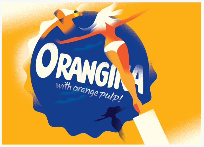
While mid-century influence has been prominently visible in areas like interior design and fashion for the past few years, it’s been a steadily growing trend in graphic work.
It’s especially prominent in the illustration styles that harken back to the iconic advertising illustrations of the post-War era. And like in that era, small companies and start-ups are recognizing the power of custom illustration work. We’re seeing a lot of brands launching with gorgeous websites, full of these mid-century influenced illustrations, often rendered in a clearly modern style but retaining dreamy vintage color palettes. In 2019 we expect to see these continue to dominate web and in print work as well.
Are you ready for design in 2019? antipod is there to support you to make 2019 the year you create your best work!
Give us a call and let’s discuss together about your project.
Sources: 99designs.ch; merehead.com; InDesignSkills.com. You can check the full articles of Meg Reid and Pavel Krivoruchko for more graphic design trends.
Illustration by Lana Marandina


