ADAPTATIONS OF LOGOS AND GRAPHIC GUIDELINES: A NEW FREEDOM?
Logotypes evolve over the years and trends – not only speaking about their specific deign, but also in terms of variants and forms of adaptations. For several years now, there have been more and more and diversified variations, due in particular to the proliferation of digital media. But today, fields of applications go even further and seem to offer a new freedom.
antipod has investigated fields of visual identity applications to open new avenues of inspiration for you.
Signage: a new occupation of space
For a long time, signage has remained simple, sober and based on the statuary identity of brands – today it has taken on a new dimension. Street art, urban furniture design and artistic installations have contributed to prepare the ground: signage now occupies the space playing with the relief, the perspective or the elements surrounding it, which brings a new look on brands.
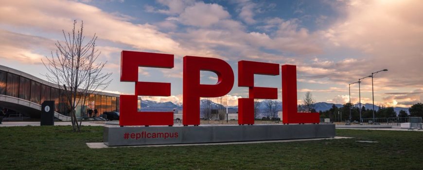
Here is a first striking example with the new EPFL (Ecole polytechnique de Lausanne) totem pole, designed by Moser: the Swiss cross, incorporated as a clear space in the logo, offers a perspective on the campus.
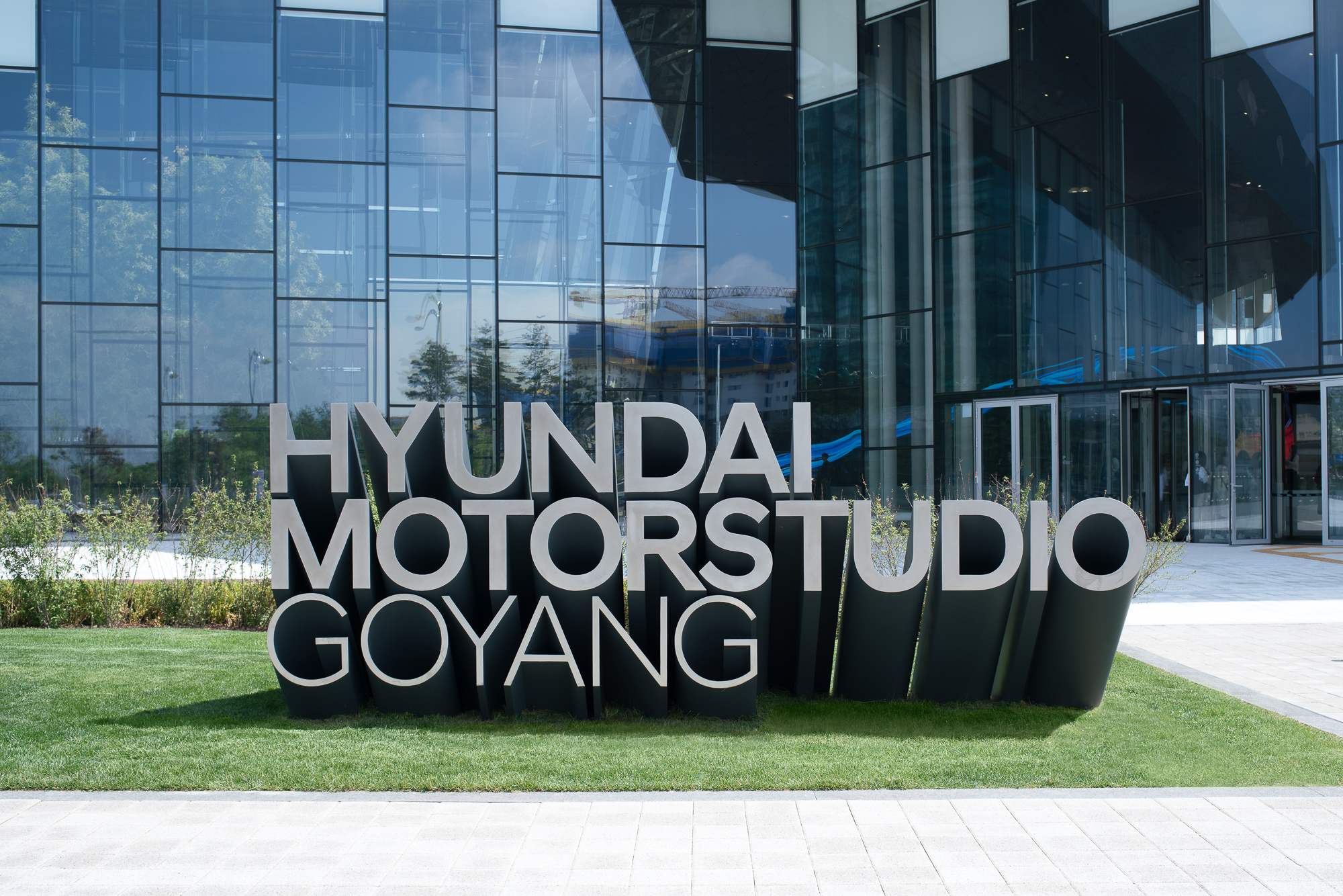
The new Hyundai Motorstudio from Goyang also plays with physical space and environment to assert its identity with a metal structure at the entrance of the building.
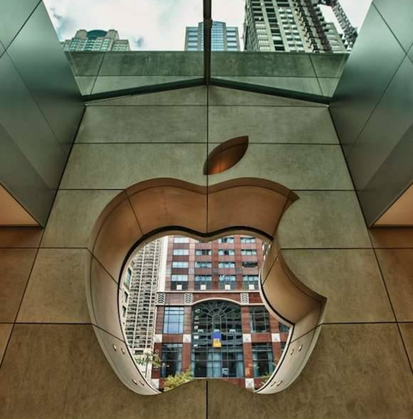
Another example of perspective, with a logo that is fully incorporated into the walls of an Apple Store.
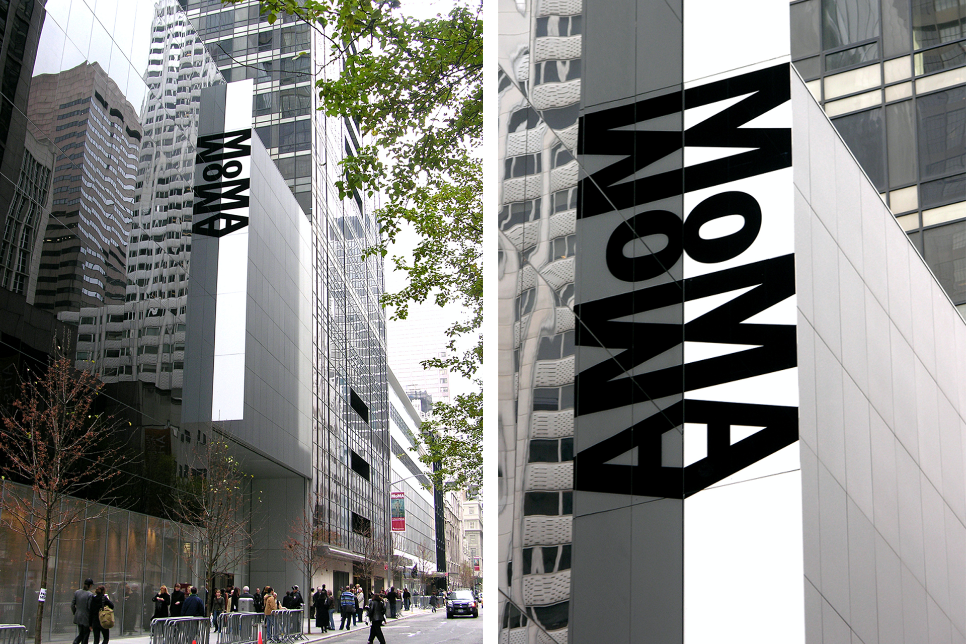
Finally, the very relevant case of MoMa in New York, with the use of the mirrors on a facade to play with the reflections and highlight its typographical logo. A striking sign by its simplicity and its perfect adaptation to its environment.
Thus these recent examples of signage from major institutional brands are emblematic of a new level of requirement in signage, based on the incorporation into space and the highlighting of the logo, therefore of brand identity, in its physical environment.
When imagination comes into graphic guidelines
As we mentioned in our previous article, the formats and supports are now very varied, and the variations of identity applications are more and more numerous. As a result, graphic guidelines, which remained for many years rather formal and restrictive, have evolved towards a certain freedom. They are now wider and leave more room for creativity, in order to establish a real visual grammar for brand identities.
First example of possibilities: the incorporation of the logo in the promotional message. This concept brings the identity at the heart of the campaign in a very open and creative way.
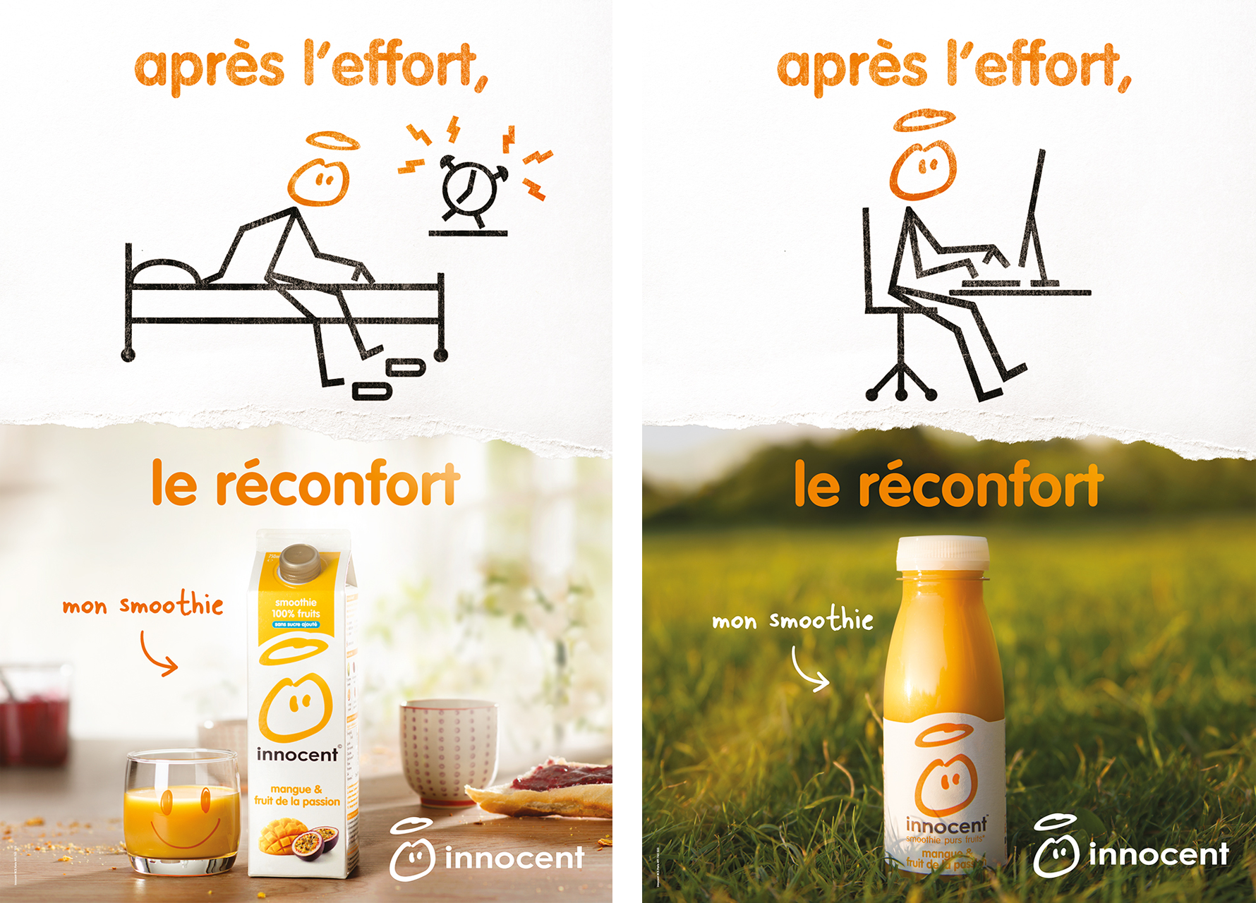
This idea is taken up by the beverage brand Innocent which has incorporated its logo in its recent advertising campaigns to illustrate the messages.
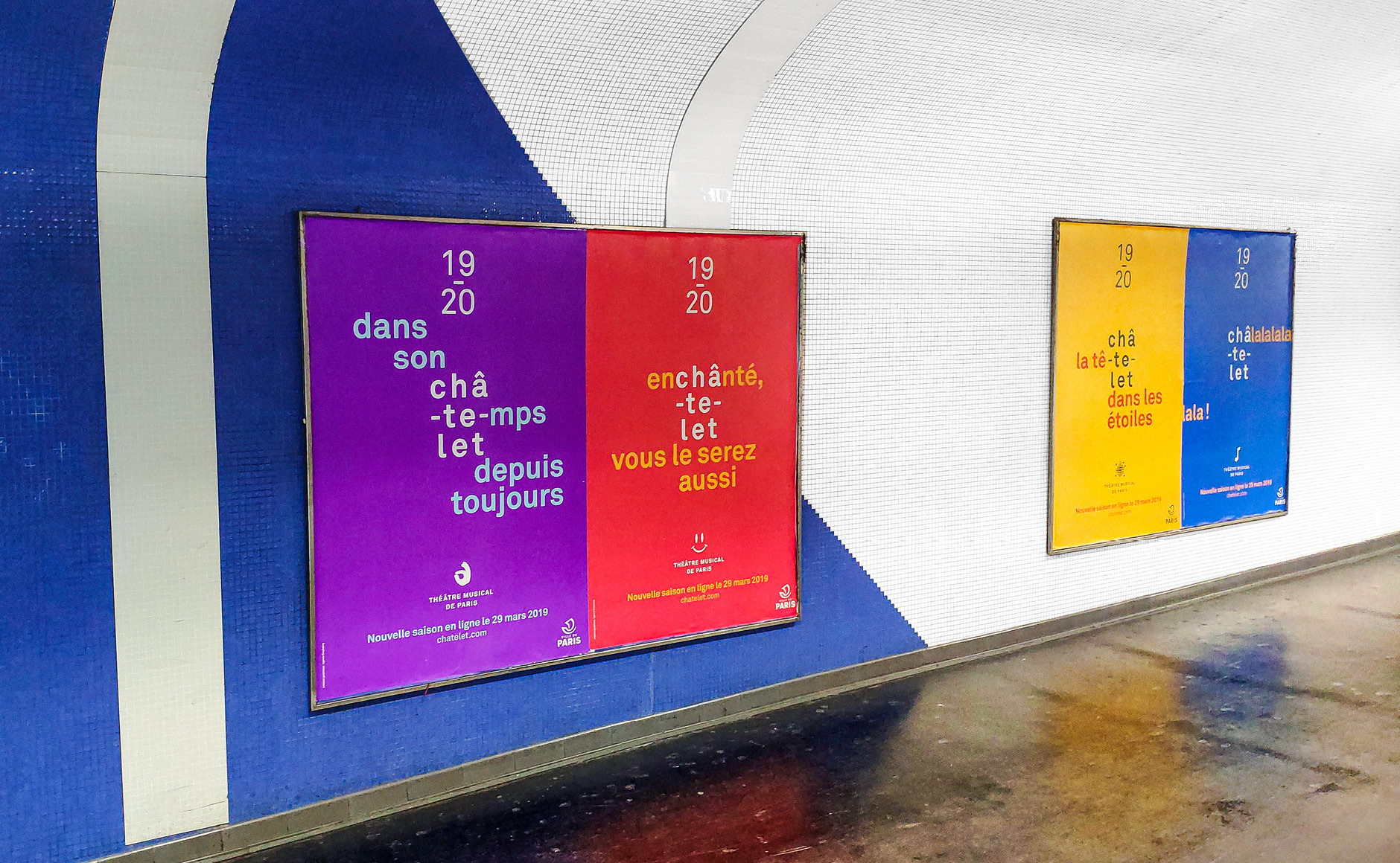
The Théâtre du Châtelet in Paris has revised its identity to make it more ‘responsive’ and adaptable. It now makes it possible to integrate perfectly into the messages of their new display campaigns, based on puns.
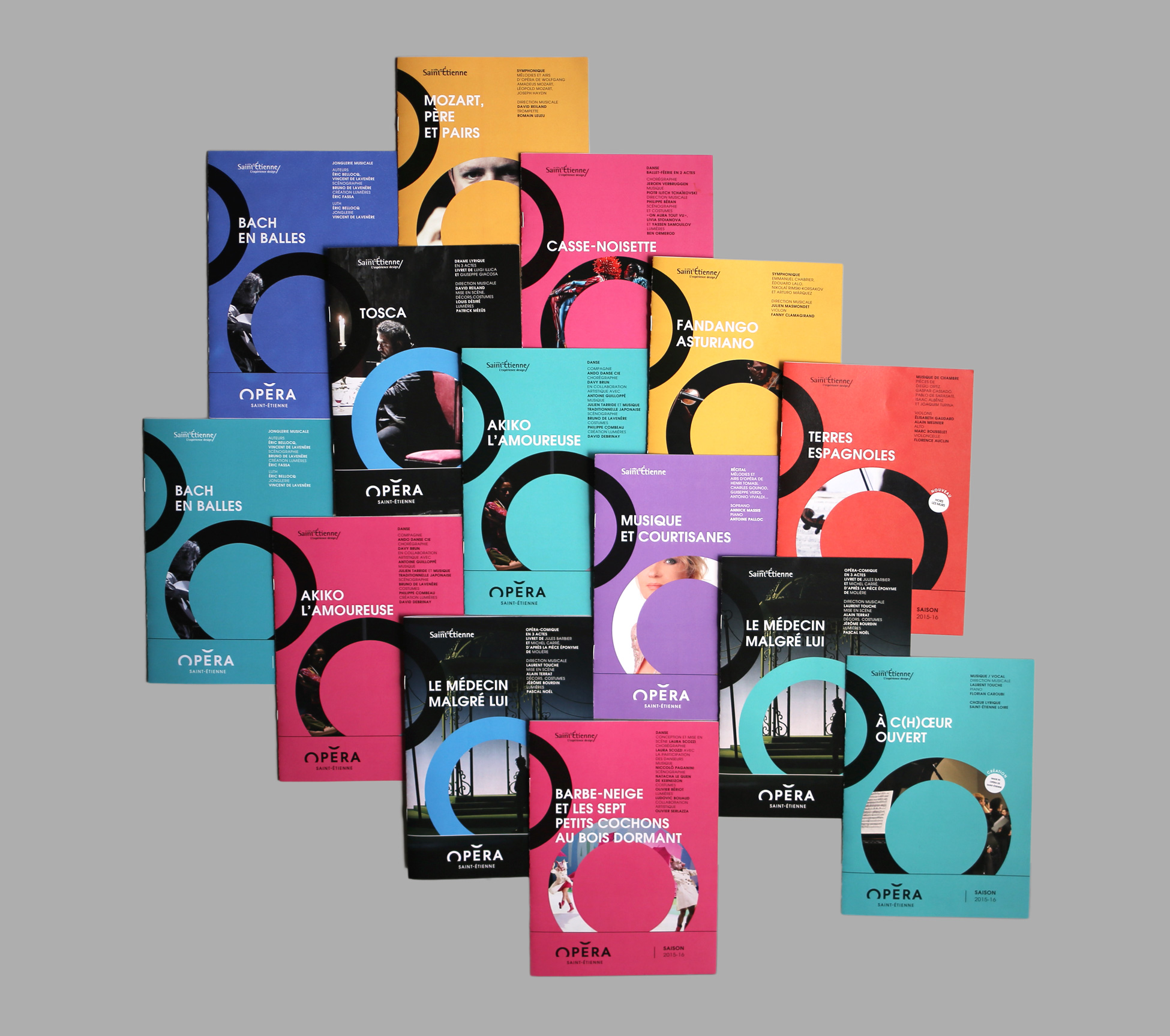
Still with the idea of a strong incorporation of the logo in the advertising message, the opera of St-Étienne in France goes even further by adapting its graphics in a range of colors and unlimited visuals, depending on the artists and performances.
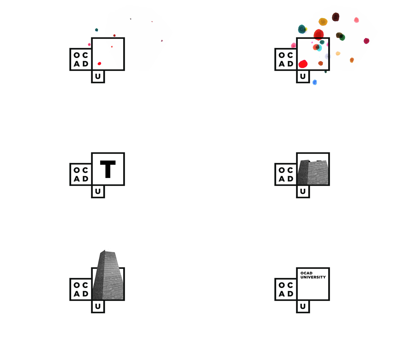
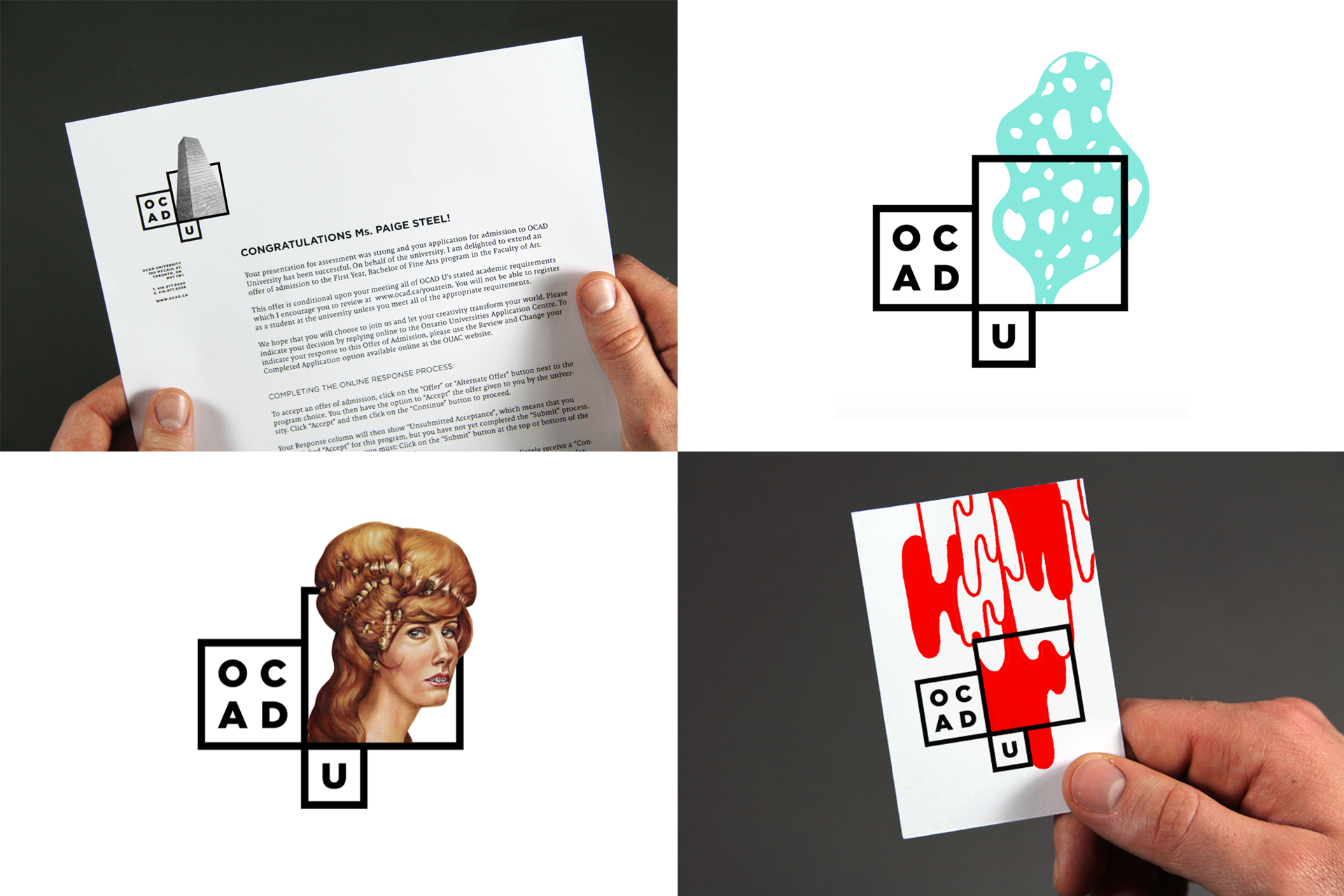
Imagination holds an even greater place in brand guidelines of OCAD University, Canadian School of Art and Design, which has succeeded to highlight its creative freedom through its visual identity. Quite simple in its basic design, it comes to infinity in its final visuals, on all supports, in a very singular way. Here are some striking variants with an animated logo for digital media, and visuals designed for corporate documents.
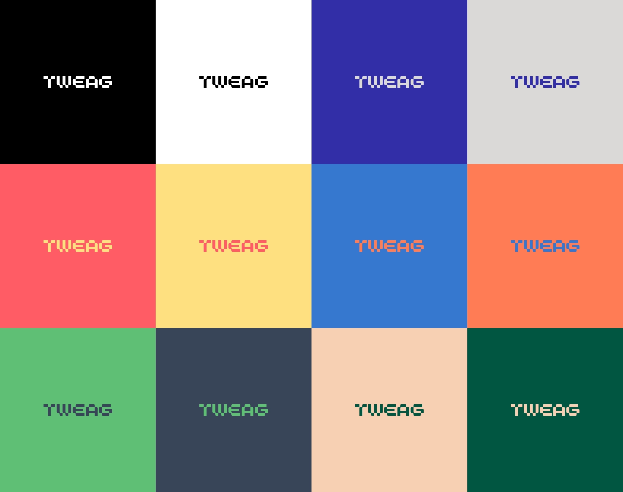
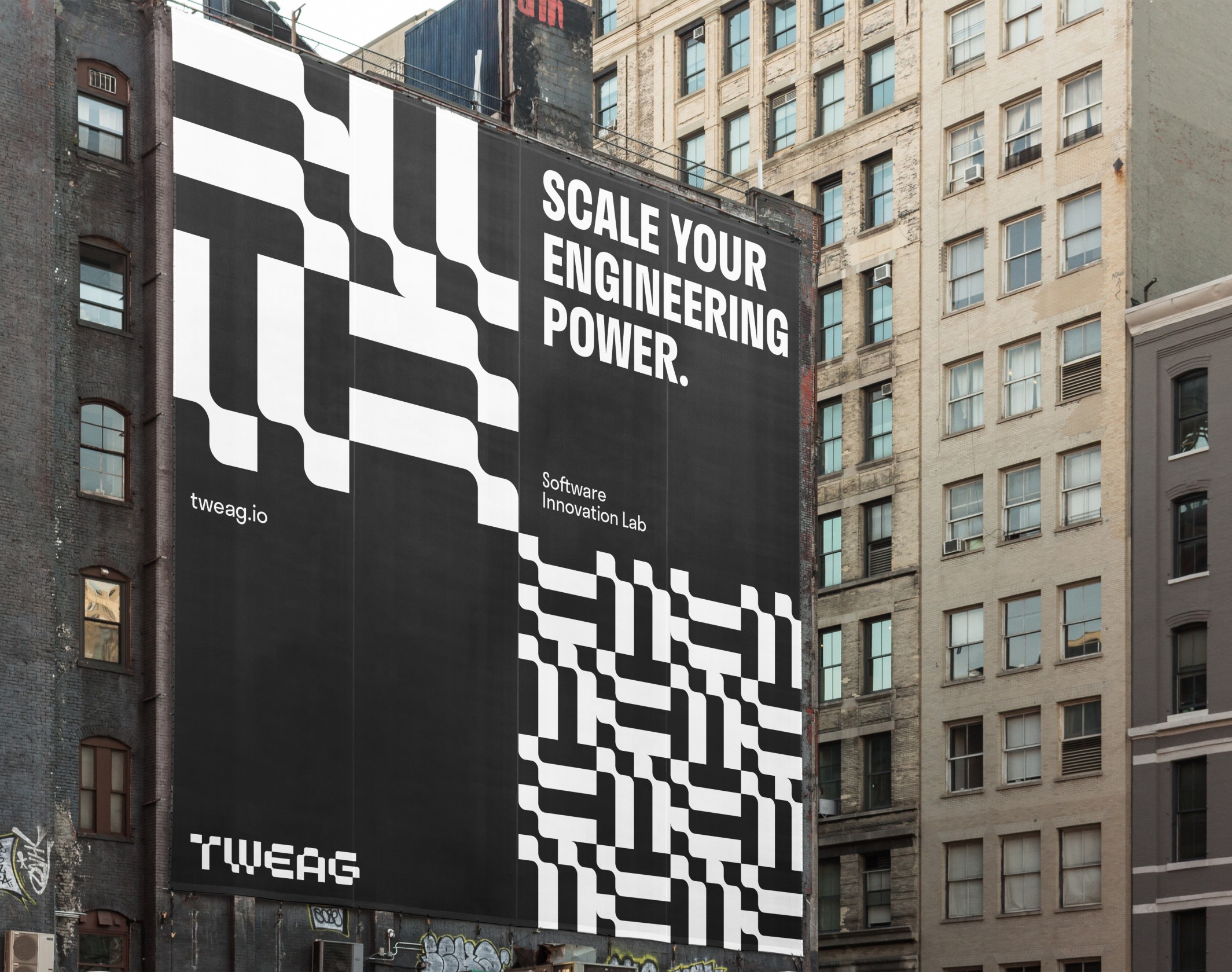
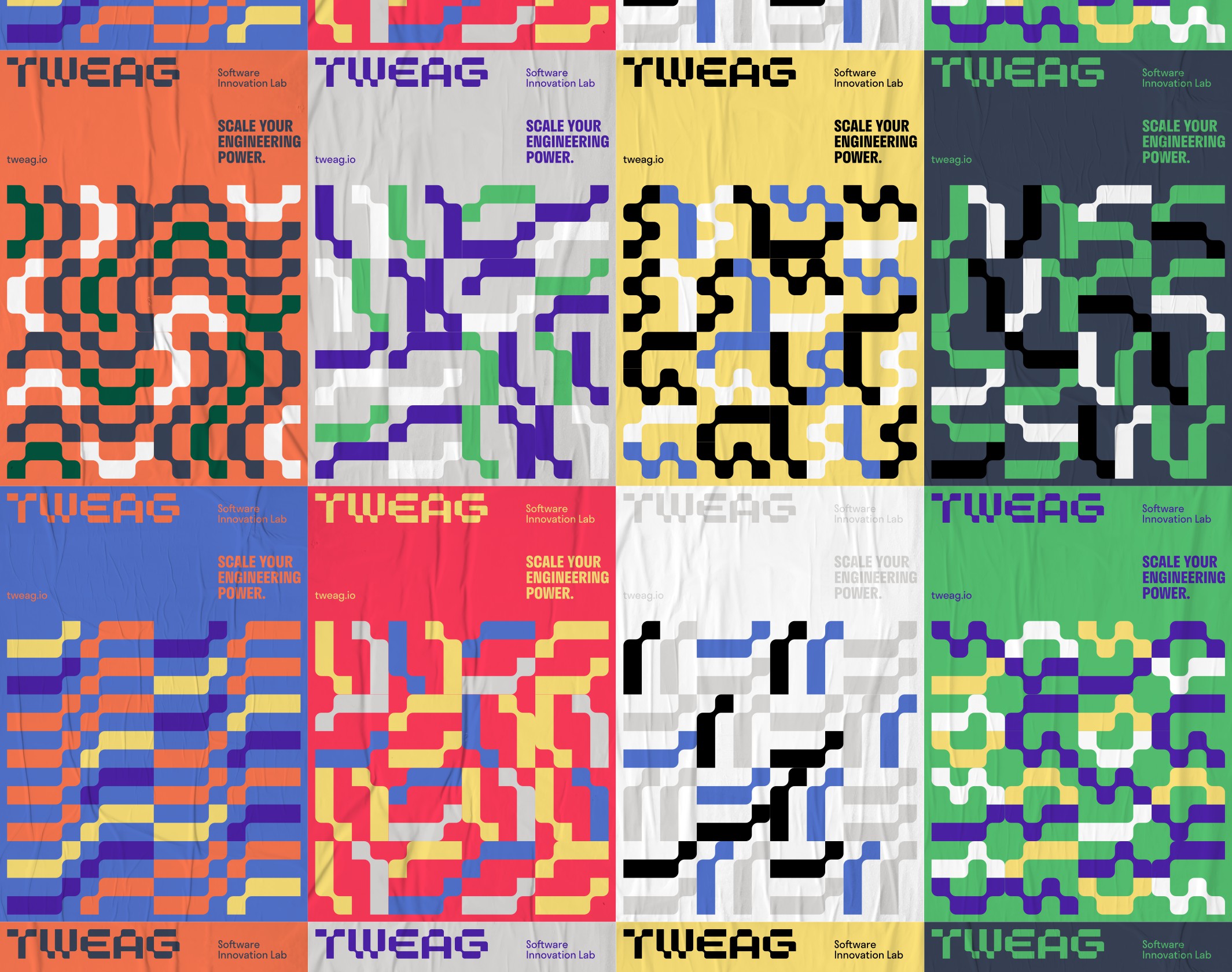
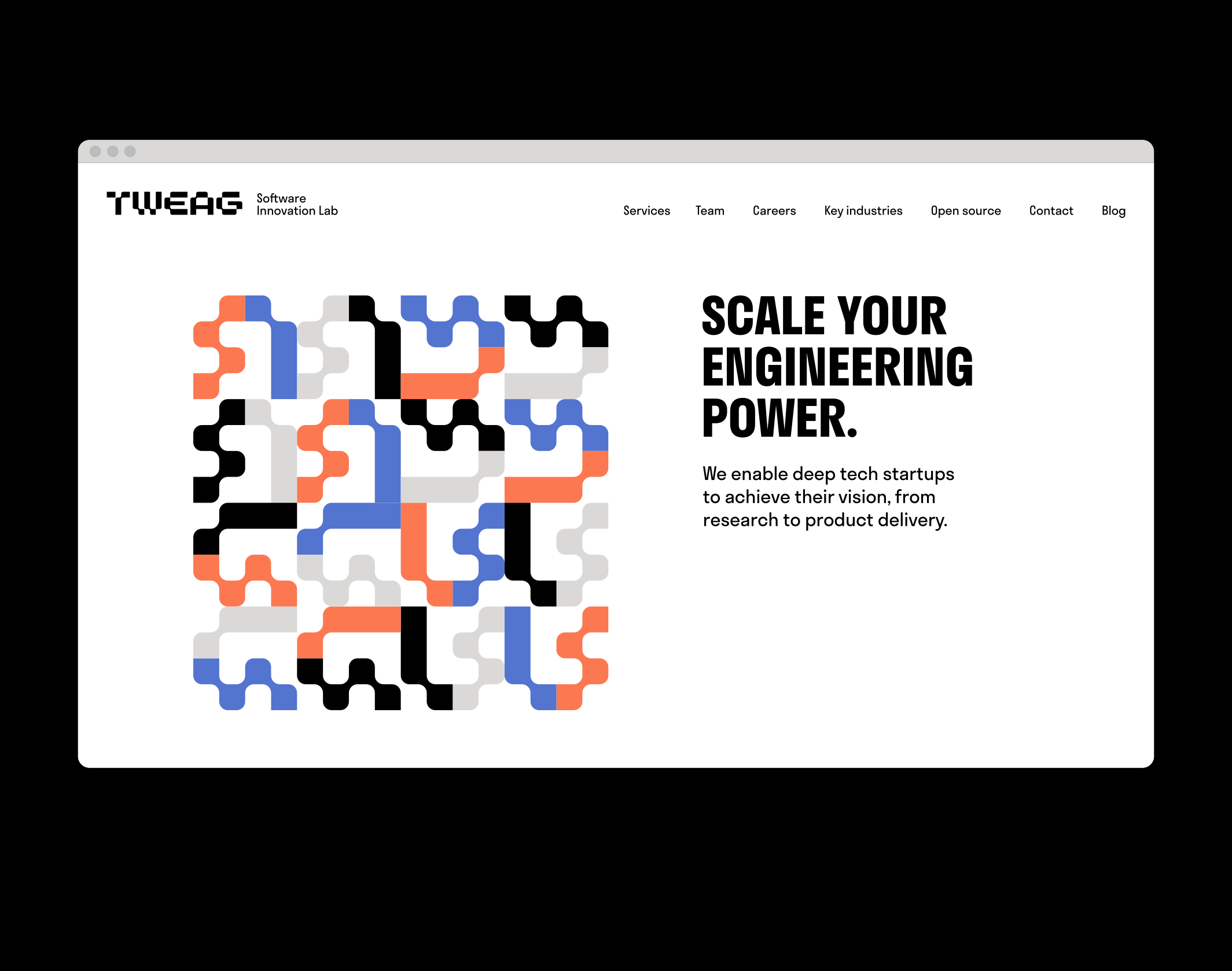
One last example for the multiplicity of visual identity adaptations: graphic guidelines of Tweag, laboratory of innovative software. A very open charter, that allows infinite possibility for adaptations for any support. Displays, prints, web banners or social networks: for each medium the identity adopts a new shape or color.
To conclude
Although the trend goes for logos going back to simplicity, their variants and applications are more and more numerous and creative today. Brand and graphic guidelines, far from restricting executions, give a clear conceptual framework which allows creative freedom, ending up to a real visual grammar for identities.
Find all our articles about trends and marketing communications news on our trendzine.
Sources & visuals :
Moser Design, Graphéine, 2×4, JBreak23, Bruce Mau Design, Eric Delmotte, Brand brother.
Découvrez nos services d’identité visuelle:


